Boost your app downloads with a quick color update
Discover how a straightforward A/B test led to a boost in conversion rates.
I am a software developer specialized in mobile apps. About a decade ago I started my career as a web developer, but I soon moved into Android native development; however for the last few years I've been building hybrid apps with Flutter. I consider myself a passionate programmer, I enjoy writing clean and scalable code. In addition to developing apps, I also have knowledge of backend services development, web development, installation and maintenance of servers, marketing applied to the growth of web applications... among other things. I also like to create video games in my free time and write about topics that interest me in the technology world: the last tech trends, experiments that I do, and topics regarding user privacy. You can find more about me, my articles and my projects on my website: davidserrano.io
Looking for a simple yet effective way to increase the visibility of your application? In this article I'll show you a real case study, where I demonstrate how changing the color of the main icon in my Weight Tracker app led to significant improvements in visibility. The purpose of this application is to give the user tools to help them maintain their weight, lose it, gain it, or ultimately keep track of their body weight over time. Read on to learn more about this case study and how I managed to improve the app's visibility in the AppStore and Google Play.
Optimizing Your App's Visibility: Strategies for Increasing Visitor's Conversion Rates
There exist various techniques and methodologies to enhance the visibility of your app. Among these, optimizing the conversion rate of the product listing can prove to be effective in persuading a greater number of visitors to download your application.
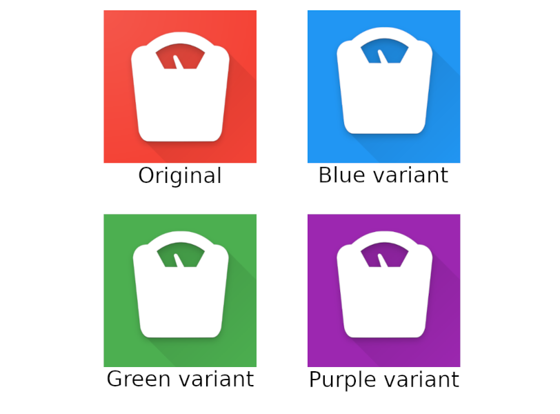
In this case, that's what I decided to do, and for that I proposed a simple change: try different variants of the application icon in different colors. My app icon is a representation of a scale, and it was red; a color not too pleasant for the visitor, so I proposed the following variants:
With these four variants, I created an A/B test on Google Play and another on the AppStore. The objective was to find out which of these variants increased the conversion rate the most in the app listing in both stores.
The experiment in Apple's AppStore was available for 84 days, and gave the following results:
Blue variant: 14.91% improvement
Green variant: 2.43% improvement
Purple variant: 13.29% improvement
On the other hand, the experiment in Google Play was live for 80 days, with the following results:
Original: 192 installations
Blue variant: 268 installations
Green variant: 228 installations
Purple variant: 220 installations
Once both experiments had elapsed, it was time to draw conclusions and make a definitive change.
Applying the winning variant
The result of the experiment was that the blue variant was the one that most increased the conversion ratio in the stores, so I made a rebranding of the application: not only did the icon change the blue background but also change the main color of the app theme to blue.
This graph illustrates the effect of the recent modification on the conversion rate over the past three months in Google Play:

In the App Store you can also see an increase in conversion in early January:

Conclusion
The experiment was a success, as evidenced by its final result. It's remarkable how a mere alteration in the color of the primary icon can significantly boost your app's downloads. It's worth noting that such optimizations should be a regular practice, not just limited to the icon but also extended to screenshots, listing texts, and other areas.
I hope this article has piqued your interest and motivated you to conduct your own experiments in your own applications.
We highly recommend giving Weight Tracker a try! You can easily download it from either the AppStore or Google Play and see for yourself its sleek and impressive interface.
Thank you for reading this far!